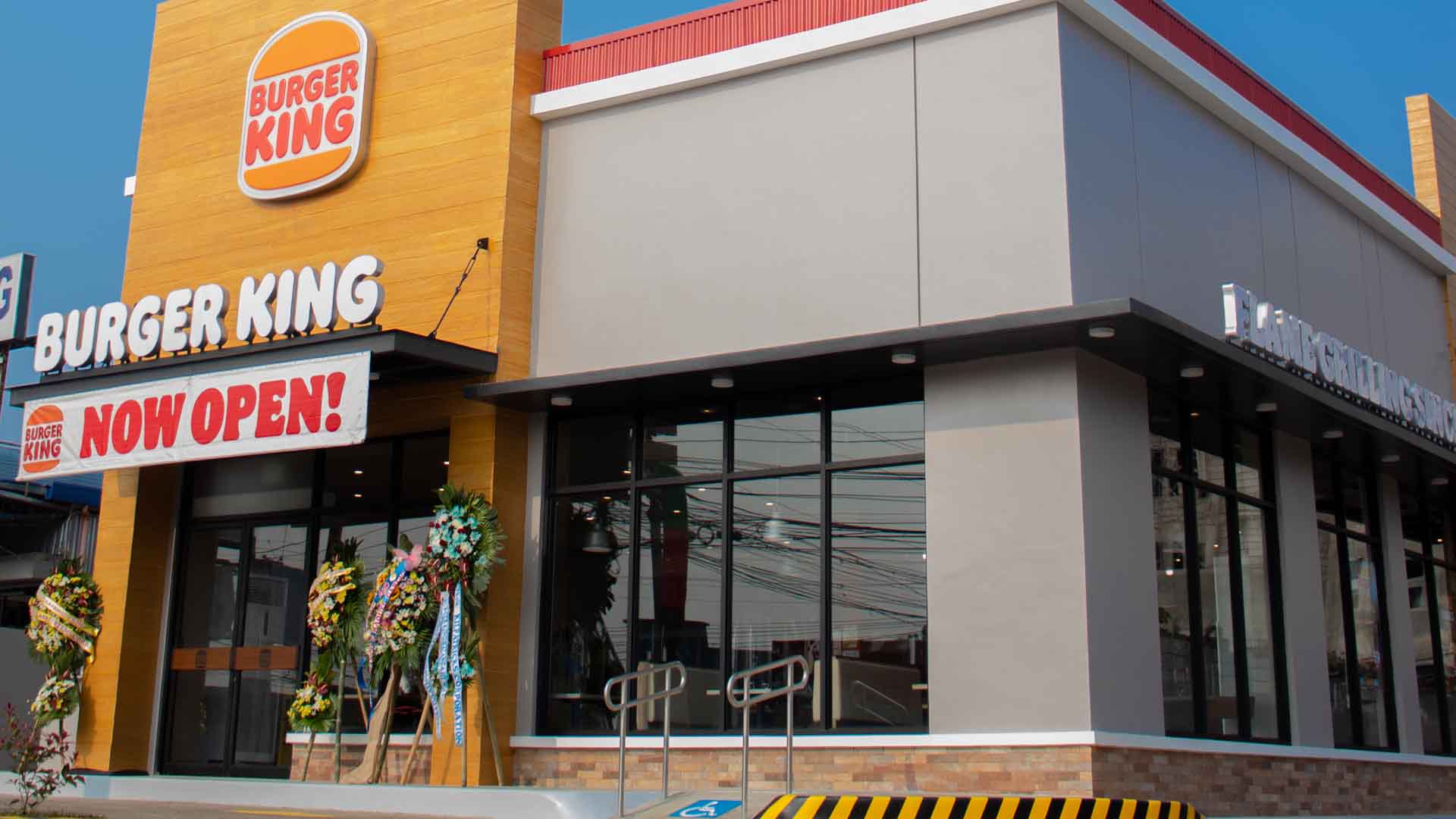
Burger King gives nothing but confidence, boldness, and fun as it dons a new look after over 20 years.
The well-loved brand is making big moves by introducing a completely new visual design that is forward-looking and speaks of the brand’s innovative evolutions in food quality, sustainability, and digital presence.

“As guests’ needs evolve, Burger King is also moving towards a more conscious approach in its self-expression and take on food quality and restaurant experiences,” said Joey Dominguez, General Manager for Burger King Philippines. “This exciting makeover after over two decades signals our commitment to improving taste and food quality standards; as well as an ambitious pledge to environmental sustainability.”
Inspired by real and delicious food, the new look is designed to more accurately represent Burger King’s authenticity, boldness, and playful irreverence, making guests feel great about their food and overall BK experience. Guests can expect the new identity on the brand’s packaging, restaurant merchandise, menu boards, crew uniforms, restaurant decors, and social and digital marketing starting the second half of the year.
“The new look indicates our confidence in the future, while remaining true to our heritage and what guests love about BK,” said Allan Tan, Burger King Philippines Marketing Head.
Visual Designs: The Burger King Way
Dialing up taste and quality through the new visual identity, every design element was royally reimagined to better reflect the new Burger King food journey that guests will crave and enjoy over and over again.

The fresh color palette is unapologetically rich and bold, the visual representation of the iconic Burger King flame-grilling process and fresh ingredients. The stylish crew outfits are fit for flame-grill masters, mixing contemporary and comfortable style with distinctive colors and graphics. The crisp new packaging proudly reps the new logo as well as bold colors and playful illustrations of ingredients. To top it all off, the fun font, appropriately called “BK Flame”, is all about the shapes of Burger King food – rounded, real, and perfectly imperfect, reflecting the brand’s irreverent personality.
The iconic Burger King logo gets a minimalist refresh that seamlessly captures the brand evolution of the times while also paying homage to the brand heritage with a refined design that’s confident, simple, and fun. Obviously, it is what BK is all about—real, simple and delicious food.
New Look Now in the Philippines

As the new visual identity starts to roll out across the world, Burger King Philippines follows suit with its new store in Balanga City, Bataan, fully decked out in the brand’s refreshed logo and new signature colors. The Balanga City branch is the first in the country to fully incorporate the new look, embracing Burger King’s well-loved designs at all touchpoints of the guest experience.
As it has done for over two decades, Burger King Philippines strives to make guests feel great about their food, and this is reflected today through the new visual design, in the new restaurant design, and across the entire digital experience. Guests in the country can now experience the exciting design evolution which has been well-received globally firsthand.
“Our fans can look forward to a pipeline of exciting activities over the next few months as we roll out the new Burger King look to restaurants across the country. Do stop by when lockdown restrictions are lifted to experience our flame-grilled difference!” invites Joey Dominguez.


